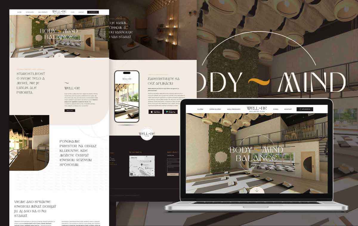
Optimize Your Website
Your website is one of the most important aspects of your digital presence, so you are going to want to make your web design the best it can be in order to be successful. Your website is the online face of your brand, your ambassador, and often one of the first impressions a customer will ever have of your business – it is the digital representation of you.
With that in mind, it’s of the utmost importance that you have the best web design that you possibly can in order to draw your visitors in, give them the best user experience possible, and turn them into loyal customers and that is why we bring you the full list of common web design mistakes to avoid.
Common Web Design Mistakes to Avoid for Success
The most successful websites are always focused on their users. This is because your users are the heart and soul of your business – without them, your company simply wouldn’t exist.
A lot of businesses make the mistake of making their website about them instead of their visitors, but the fact of the matter is that your website exists to serve your audience, not you.
All of the most common web design mistakes to avoid can be remedied by putting yourself in your users’ shoes and considering if the user experience being provided could be improved in any way.
Spoiler alert: it almost always can! Here’s how:
1. Unappealing Visual Design
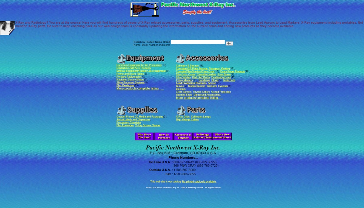
The very first thing your users will see upon opening your website is the visual design choices that have been made. Your aesthetic direction and overall site display will tell your audience how professional you are and how much effort you have put into your website. Lacking in either of these qualities sends a really bad message to your visitors.
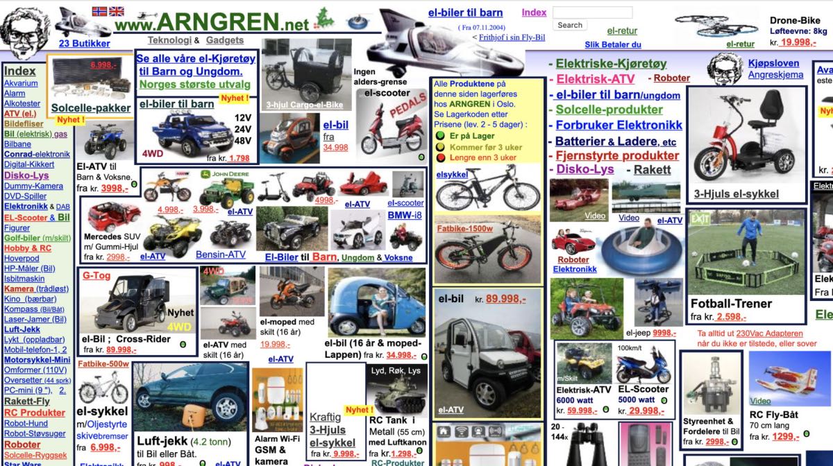
Many websites try to fit too much into too little space, overwhelming their visitors in the process. Lots of movement, flashing lights, and bright colours distract and confuse your users so that they don’t know what to focus on.
Your audience will be thrown off by a lack of cohesion and an outdated look. Content that is out of alignment and crowded, or that looks (for lack of a better phrase) just plain ugly, will do nothing for your users, regardless of how great it is.
Neglecting the visual exterior of your website suggests that you are also neglecting other areas of your business, and that user experience is not a top priority for you.

How to Fix: Unappealing Visual Design
When designing a website’s look, less is often more. Focus on the most important things you want your visitors to see, and incorporate those in a way that works together.
Match your aesthetic to your industry – a party supply store can afford to be a lot more colourful and fun than a law firm can – so make sure your colour, style, and font choices are appropriate and most importantly, consistent across the board.
Leave lots of white space in between separate pieces of content so that your customers can absorb it more easily. Within the white space, make sure that your content physically aligns with other features or content sections on your page for a coherent and appealing look.
Remember, if you were your user clicking on your website, would you like what you see?
2. Bad Content Display
The second in our list of the most common web design mistakes to avoid is a that many websites tend to display their content on their pages without any formatting and expecting readers to engage with it anyway.
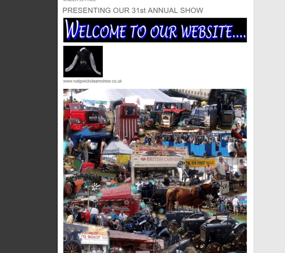
Badly written content will of course turn visitors away from your website regardless, but having even the best content won’t matter to your audience if it is composed of huge chunks of unbroken text and laid out on the page in a way that clashes with other site elements.
If the way you are presenting your content to your customers is making them put in more effort than necessary, they will leave and find more accessible ways of getting the information they need.
How to Fix: Bad Content Display
Written content needs to be readable, but even more so it needs to be scannable.
Facilitate this by inserting regular, clear, descriptive headings throughout your content and breaking up your paragraphs into longer chunks. Put any important words or phrases in bold so that users can easily pick them out, and display the content pieces on your page in a way that visitors will be able to find what they are looking for with as little effort as possible.
Remember, if you were your less knowledgeable user, and you were looking to get information from your website, how hard would you have to work to do so?
3. Unhelpful Page Navigation
No matter how high quality your content and information is, it makes no difference if your visitors are not able to easily find it.
A lack of clear navigation will leave your users confused and disoriented, and unable to find what they are looking for, which creates an incredibly bad user experience.
Menus that have too many links that are disorganized, uncategorized – or worse – broken, will overwhelm and frustrate your visitors.
Menus that do not link to all the necessary pages in the first place are equally frustrating, and will drive your conversion rates down.
If the visual layout of your website isn’t effortlessly guiding your users to where they want to go, it is not doing its job to serve them.
How to Fix: Unhelpful Page Navigation
Your visual layout, buttons, and calls to action need to work together in order to guide your users to where they want to go. Make everything clear, visible, and inviting to encourage your audience to click.
Designing your website with a “flat” structure is probably one of the most important fixes of all. This means making sure that every page of your website is as few clicks away from any other given page as possible, always. Especially important is to make sure that every important web page on your site is clickable from your home page.
Your menus should also be functional and organized, and every link should work as intended.
When it comes to navigation, your website needs to take all the effort away from your visitors so they can focus on absorbing all the great content you have to offer and making tons of conversions for you.
4. Incoherent Company Branding
Another point from our list of the most common web design mistakes to avoid is regarding your branding. If your website design does not fall in line with the rest of your company branding, you are making a big mistake.
Your branding is supposed to let your customers know exactly who you are and what you’re about. It includes everything from visual choices (your colours, logo, fonts, and graphics) to your voice and messaging.
If your visitors click on your website and are unable to instantly recognize it as belonging to you, you will not be able to establish a recognizable brand identity with them, and they will come to associate your company with inconsistency.

How to Fix: Incoherent Company Branding
When deciding on your branding direction for your business, make sure it’s truly representative of your industry, your values, and your company culture.
Once you have a dedicated brand kit, incorporate its elements into every facet of your business. Your website’s colour palette and fonts should be the same ones used in your physical stores, your print media, and your social media graphic content.
If you are undergoing a redesign or a rebrand, make sure you give your customers lots of warning, and then launch your new look simultaneously across all platforms. Remember, consistency is key.
5. No Conversion Journey
Another item on our list of the most common web design mistakes to avoid is regarding conversion journey. Getting visitors to your website and providing them with content is one half of the equation to having a successful site; the other half is getting them to interact with your content and make conversions.
Many websites fail to execute this second step, assuming that if they provide high quality information, users will take action on their own.
Unfortunately, this is not the case, and if your website doesn’t provide the right tools, features, or encouragements to get users to interact with you with as little effort as possible, you will not see the conversions you deserve.
If your users click on your website and are not given clear instructions on how they should be interacting with it in order to solve their problems, they will leave to find a competitor who will lead them through the conversion journey much more easily.

How to Fix: No Conversion Journey
Start by choosing a specific call to action for every page of your website – make it strong, visible, and clear so that there is no confusion on what the goal for that specific page is.
Place your calls to action strategically around your content, so that your visitors will feel compelled to click on them by what you’ve been saying.
Make sure you are also providing all the necessary tools that your customers need – if you want them to book an appointment, provide a booking form. If you want them to visit you in-store, provide a google maps location.
Whatever you can do to make it easy for your users to turn from browsers into customers, integrate it to improve the conversion journey.
6. Unresponsive Design
The web can now be accessed from every device imaginable, and websites that won’t adapt to being usable on each one will never be successful.
Responsive design is a way of designing websites so that their view and interactivity automatically respond to the specifications of whichever device they are being viewed on.
Also known as being “mobile-friendly” because of the heavy emphasis on smartphone traffic, responsive design is a website essential if you want to be accessible to the entirety of your user base.
How to Fix: Unresponsive Design
Large, horizontal desktop layouts will not translate to small, vertical mobile phone screens, and so you will need to consider what needs to adapt.
Text will need to be adaptable to a readable size in a single column instead of larger chunks spread out over more space.
Images will need to be flexible and large enough to be visible in the context of the smaller phone screen.
Menus will need to be collapsible so that screen space is only ever taken up by the most relevant content instead of everything being displayed all at once.
Buttons and other functions will need to be tappable instead of clickable as they are on non touch-screen devices.
If you make changes like these to your web design, you will provide a much improved user experience for your mobile browsers and encourage their business through increased accessibility to your content.
7. Slow Loading Time
If there’s one trait that today’s web users all share, it’s impatience, which is why your web design will not be successful if it doesn’t load fast enough for people to wait and see it.
If your web pages load slower than 2 seconds, a significant portion of your web traffic will leave to find what you offer somewhere faster.
Your website needs to be both high quality enough and fast enough to hold your visitors’ attention.
How to Fix: Slow Loading Time
Your website is most likely being slowed down by having to process large pieces of unnecessary code to present to your viewers.
To speed it up, reduce the size of your web files and images so that you are balancing file size, functionality, and quality more effectively. 1200 pixels is typically a good size for an image, and it will show up just as well as a picture twice as large as that.
Another good option to speed up your website is to take a look at the capacities of the web hosting platform you are using, and consider making an upgrade. If you are operating a website that is too large for your platform to handle, it will be reflected negatively in your loading speed.
8. Negative Social Proof
The last but not least item on our list of the most common web design mistakes to avoid is regarding the social proof. Social proof is a great tool that uses people’s tendency to follow the crowd to provide free evidence of you having an existing customer base who loves your business and what you are offering – except when it isn’t.
In unsuccessful web design, social proof will either not be displayed at all (i.e. no customer reviews, testimonials, statistics, industry awards, etc), or negative social proof (i.e. bad reviews, irrelevant testimonials, disappointing statistics) will be displayed, effectively driving customers away.

How to Fix: Negative Social Proof
When it comes to the social proof you are receiving, it helps to know how best to incorporate it into your website so that it is best serving your business.
Not displaying any social proof signals at all can demonstrate that you have no customers and that your product is not worth buying, so always be sure to include it where you can, unless your current metrics are on the lower end, in which case it can do more harm than good.
In the case of explicitly bad social proof, such as a negative review, it can often be beneficial to publicly turn a negative into a positive by responding. Politely answering a bad review with an apology and an explanation of how you plan to fix the problem moving forward will demonstrate both to the customer and to the rest of your audience that you care about them and their experience, and are dedicated to making things right.
Of course, the most important thing to do is to display any positive social proof you receive with pride, letting your past customers and industry experts vouch for your company themselves.
To Conclude
The difference between a successful and an unsuccessful web design really comes down to whether you are making sure your user experience comes first. Taking the elements that matter the most to your audience and making sure they are optimized for success will put you on the right track to a ton of conversions and happy customers.
Is your website suffering from some of these common web design mistakes to avoid? Idea Marketing is offering a free website audit to help you see exactly where your website is hitting – and missing – the mark! Get yours today!
