What should a website include?
Your website is your company’s digital spokesperson and sales rep all in one, so it is extremely important that it is designed well in order to make a successful impression on your users. Your users will be the people actually interacting with your website and bringing you business, so the more your web design is focused on them, the more successful it will be.
Users who have a positive experience with your website are far more likely to become customers because the web design will have enticed, captivated, and guided them into becoming a member of your audience. Hence, user interface and user experience design are two of the most important considerations to be accounted for in any web design project, and are at the core of almost every element involved in the web design process. We created the list of 8 most important elements of good website design that you should follow in your website design process.

Top 8 basic elements of a good website design
Consider your user base at all times when incorporating the following principles of web design examples into your site. Even when not explicitly connected to your users, each one is only deemed successful when it has a positive impact on them. And as to consider elements of a good website design is very important, it is also important to take into consideration to avoid certain mistakes and that is why we prepare the list of 8 common web design mistakes to avoid.
1. Visual Design
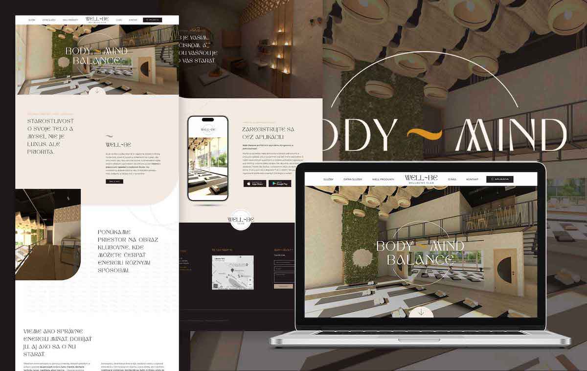
The most obvious and possibly most telling aspect of your website’s design is the aesthetic choices that your users will immediately see upon clicking on your website. The visual aspects of your website must work cohesively together in a way that makes sense and is not overwhelming for your visitors. When choosing a visual direction, minimalism is key – focus on a few simple elements and then work out how to lay them out so that your audience has space to process what exactly you are trying to give them. Visitors will want to stay on sites that are attractive and easy to absorb.
Good Visual Design
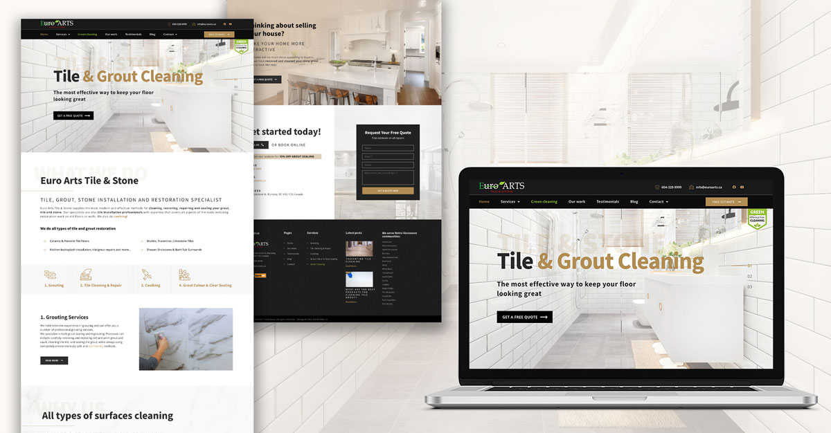
Your typography and fonts should be universal across the board (for example, your body paragraphs should be formatted the same way as every other body paragraph that occurs in your web content), while your colours should remain simple and belong to the same palette. White space (also called “padding”) is very important to include, especially between different pieces of content, as it increases readability and draws users’ attention to the key parts of your site, such as your calls to action. Content must also be kept in alignment with other sections on the page for a clean and well-structured look.
Bad Visual Design
Trying to incorporate too many elements into your web page is never a good idea as it will overstimulate and overwhelm your visitors. Mixed fonts, clashing colours, and a lack of spacing will draw away from your users’ ability to understand your messaging. Always keep it simple and attractive!
2. Content Display
Website visitors are scanners, not readers, which is why the layout and organization of your content has to be tailored so that your audience can quickly and easily identify the key content they are looking for. Your content writing in particular should be engaging, informative, and concise, and structured in such a way that your visitors can absorb it with as little effort as possible.
Good Content Display
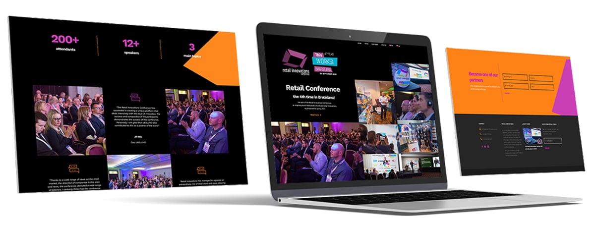
Clear, eye-catching headings, short paragraphs, and bolded statements can help direct your users’ eyes to where you want them to go. Make sure that the way you display various pieces of content on your web page allows your visitors to find what they need as quickly as possible.
Bad Content Display
Content that is composed of long, wordy paragraphs will either bore or overwhelm your readers, who would rather be able to grasp the main points of your writing at a glance. Content that is displayed together jarringly on a page will also turn visitors away before they even get the chance to read it.
3. Page Navigation
Making it as easy as possible for your visitors to navigate your website is another principle of successful web design process. Clear, functional menus that are accessible from every page should make it consistently simple for your users to know where they are on your website, and how to access where they would like to go.

Good Page Navigation
Make sure that every important page is accessible from your home page, and that every piece of your website’s architecture is as few clicks away as possible. Let the visual display of your website guide your users to where they want to go, with smart layouts, clear buttons, and strong calls to action.
Bad Page Navigation
Users should not have trouble finding the pages that they need on your site in the fewest number of clicks possible. A menu with many links but no categories or subheadings is overwhelming, while a menu that doesn’t link to all the necessary pages at all is confusing. The worst navigation experience of all is of course broken links, so make sure that every link in your website is working as advertised and directing your users to the correct pages.
4. Company Branding
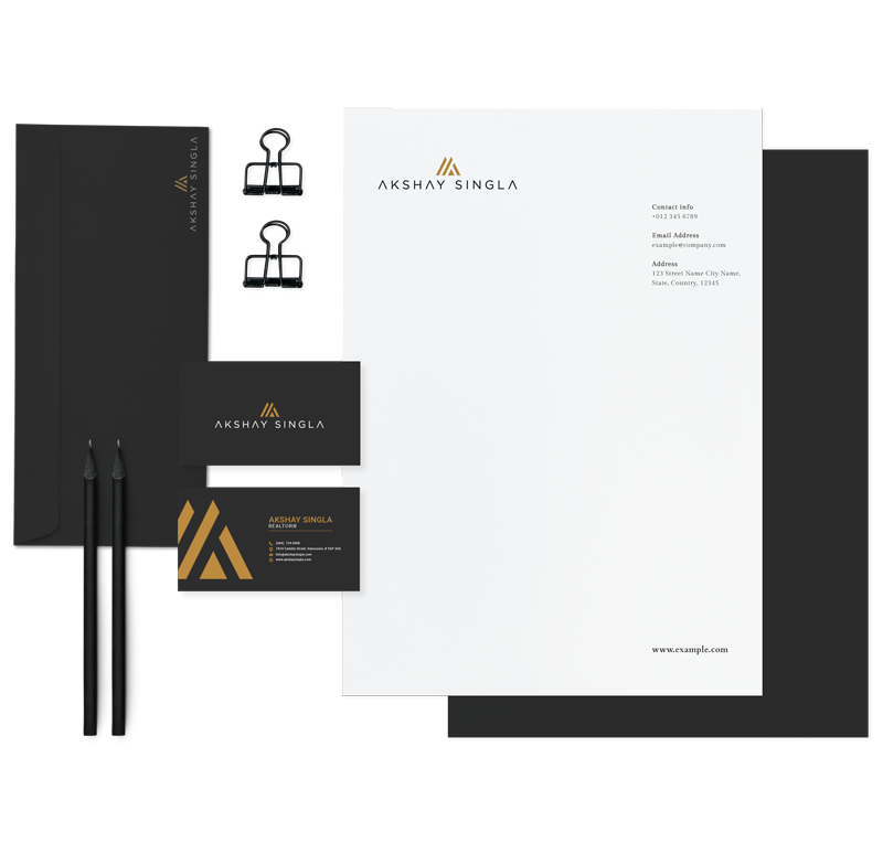
Your company branding is the visual face you attach to your business that shows your customers who you are and it is also one of the most essential elements that you should develop for your business. All of your design choices such as your logo, colour palette, and typography, as well as your value proposition and content’s written voice comprise your brand kit, and it is essential that your branding is applied to your website just as it is to any other aspect of your business.
Good Company Branding
Your website should be instantly recognizable to your visitors as belonging to you. Your website’s visual and written elements should reflect your established messaging across your physical stores, print copy, and social media presence. Consistency throughout every facet associated with your business enhances your brand’s credibility and ensures your company provides a memorable experience to its customers.
Bad Company Branding
Misrepresenting your brand on your website will leave your visitors confused. If your displayed logo is different from the logo on your social media pages, or if your website’s fonts are a completely different style than the sign on your storefront, your audience will understand that they can’t expect consistency from you, and move on to a company that knows how to establish itself.
5. Conversion Journey
Your website does not exist merely to inform your visitors about what you do, but to get them to interact with you. Whether or not you have the most engaging content in the world, if you are not encouraging your visitors to take some form of action whenever they are on your website, they won’t!
Good Conversion Journey
Strong, clear, and visible calls to action are absolutely essential to include on every web page, and should always be laid out in such a way that your users are guided on a clear path to completing the conversion goals you have set for your website. Provide your users with all the necessary tools to turn them from browsers into customers!
Bad Conversion Journey
If, for example, you run a salon and want clients to book an appointment through your website, simply telling them about how great your services are won’t be enough to get them to do so. Having service pages while not incorporating a clear online booking form or consistently encouraging your customers to use it through a call to action such as “Book Today!” will not provide your audience with the tools they need to convert. If your contact information and salon location are not always clearly visible, and your content isn’t geared towards encouraging this specific conversion goal, your visitors will find another business who can meet their needs.
6. Responsive Web Design
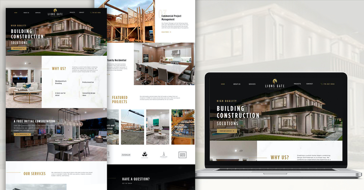
Responsive web design is one of the most important web design principles as it gives your website the ability to adapt its layout and functionality to the dimensions of whichever device it is being viewed on, whether that’s a desktop, tablet, or mobile smartphone. The technological landscape has shifted so much that today, almost 70% of all web traffic comes from mobile phone users. In order to connect with the entirety of your user base, it is vital that you incorporate responsive design into your web structure so that you are not alienating customers for no reason.
Good Responsive Web Design
To give an example, a website that may have two columns of text next to each other horizontally when viewed on a desktop, may have those same two columns of text stacked vertically when viewed on a mobile phone in order to account for its smaller screen size and portrait orientation. Any images will have also been adjusted to fill the mobile screen while still making sense in the grander scheme of the content, and all functions will respond to touchscreen interactions instead of mouse clicks.
Bad Responsive Web Design
If this same website were non-responsive, the mobile phone user would have to contend with a very small desktop version of the website, which would be virtually unusable. The words would be too small to read and the functionality would not be the same, resulting in a poor user experience. Users and search engines alike value responsive design very highly and it is a feature that no successful web design should be without.
7. Loading Website Time
Today’s web users are more impatient than they’ve ever been, which means that having a rich, attractive, and engaging website is of no use to you if it loads too slowly to keep your visitors’ attention. Slow websites do not get conversions because your customers know that your competitor will be able to deliver the exact same experience, only twice as fast.
Good Loading Time
To speed up your website, reduce or convert your image files to allow for a better balance between size and quality – for instance, JPEGs are typically a more web-friendly image option than PNGs, while compressing your web files will also reduce space considerations yet still allow for functionality. Optimizing the elements on your website as well as improving your web hosting capabilities will allow for much faster loading times and happier customers.
Bad Loading Time
Large, ultra high quality images, lengthy videos, and big web files will negatively impact the loading speed of your website. If these issues are not taken care of, your visitors will not be sticking around long enough to see if your company is worth it.
8. Social Proof
An often overlooked but extremely powerful form of free marketing that should be incorporated into every successful web design is social proof. Social proof is based on the idea that people tend to follow the crowd – therefore if you prove that “the crowd” is a fan of your company, more people will also want to see what you’re about.
Good Social Proof
On the web design side of things, social proof is incorporated through elements like visible client reviews, testimonials, industry awards, and user generated content to name but a few, and it is a great way to prove that those who have come before have had a positive experience with your business.
Bad Social Proof
Social proof is obviously not helpful for your website if none is being displayed at all – indicating no evidence that your business even has a reputable customer base, but equally damaging can be displaying negative social proof. If your company gets a bad review, for example, publicly address it to the customer themselves, express your concern, offer an apology, and detail how you intend to make it right. This way, you are turning bad press into good press by showing that you care about the customer experience, as opposed to leaving it to publicly do its damage on its own.
To conclude
There are so many ways you can optimize your web design to increase its success. Whether up front or behind the scenes, taking these elements into consideration will result in happier users who will be more inclined to make conversions!
Is your website designed for success? Get a free website audit from Idea Marketing to find out! You have nothing to lose and everything to gain.
